WELCOME!

Sunday, August 31, 2014

project life 2014: spring spread

Just a warning, there will be several project life posts in short succession on here, mostly because I'm trying to get into a rhythm with this project and have to squeeze these posts in!

Because I started my project life in the middle of 2014, I've missed documenting over half of the year. I figured I had a couple of options. I thought I could go back and do monthly spreads, but I honestly thought I'd be stretching for quality material. I also could have just started where I wanted and left the rest out. I opted instead to do three seasonal spreads, since I'm starting my project life just in time for fall. 

This is my Spring 2014 spread. Spring was a huge time of growth for us and it was a joy to reflect on it as I made this spread.


materials used
Seafoam core kit.
Pocket pages cards & stickers.
Avery labels.
Photos taken with an LG G2.

Thanks for stopping by, friends!

Saturday, August 30, 2014

project life 2014: winter spread

Just a warning, there will be several project life posts in short succession on here, mostly because I'm trying to get into a rhythm with this project and have to squeeze these posts in!

Because I started my project life in the middle of 2014, I've missed documenting over half of the year. I figured I had a couple of options. I thought I could go back and do monthly spreads, but I honestly thought I'd be stretching for quality material. I also could have just started where I wanted and left the rest out. I opted instead to do three seasonal spreads, since I'm starting my project life just in time for fall. 

So, here is winter 2014. I made this with a combination of instagram photos and personal photography that I took in the first few months of 2014. 


materials used
Seafoam core kit.
Pocket pages cards & stickers.
Avery labels..
Photos taken with an LG G2, Droid Bionic, iPhone, & Nikon D700.

Thanks for stopping by, friends!

Friday, August 29, 2014

project life 2014: title page

what is project life?
Project Life is a memory keeping system created by Becky Higgins.

I bought my first project life kit in 2013 when I saw awesome examples of it on Pinterest. Like lots of those bloggers, I will proclaim that I'm 'not into scrapbooking.' And that is true. Through all of my crazy projects and years 4-H, scrapbooking was just something I couldn't get on board with. It seemed busy and like so much work. But the first project life layout I saw on Pinterest had me hooked. It was often simple, clean, and beautiful. It heavily featured photography, which obviously appealed to me. The pockets in the divided 12x12 sheet protectors make spaces where you can slide in photos or slips of paper. You can embellish or not. Your pages can just be words and photos, whatever you desire. It doesn't require that big of an initial investment, especially in my case because I bought many key pieces with coupons or on sale.

I did a week and a half of spreads in August 2013 and then quit. I tried doing it all from scratch, and I just didn't want to make the time. It seemed so crazy trying to cut out all of those pieces of paper and attempting to design something beautiful. I wanted it to look perfect, and when it didn't I gave up.

Fast forward to almost exactly one year later, and I felt myself getting drawn in by project life all over again. Finding myself in a season of life where I really feel like time is flying by and I'm just sleepwalking through the weeks, I had a deep desire to record the little things that I were happening around me. More than just an act of documenting moments, I began to see the potential that project life had to serve not just as a record, but as a physical act of thanksgiving at the close of each week.

better late than never
In certain cases, I can get on board with the old idiom above. This is one of those cases.

I briefly fought the part of myself that said I should wait until January 1 to start this project for 2015. That little voice inside said that 2014 is over half gone, and I shouldn't start now. I wonder how many dreams and ambitions are put off this way? So, I decided to forge ahead.

materials
I found a 'core kit' (a prepackaged group of cut 4x6 and 3x4 cards that fit into the pockets without cutting) on sale, and with all of the pre-cut patterned journaling cards and accent cards, I realized I could build this pretty quickly. I got a few books of embellishments and some letters and set off! Full materials are listed at the bottom of this post.


getting started
If you know me, it is no secret that I love glitter and all things that sparkle. I decided to create a little cover page on the front of my title page with the one word that I want to live the rest of this year by: hope. I have seen a few examples of other Project Lifers sewing things into their pockets, which I think is an awesome idea. What better material to use than glitter? :)


I'm sure it will be different making a title page at the beginning of 2015 that sets the tone for how I want the year to be. 2014 feels like it has been a big year so far for Ayron and I and our marriage. We've had a lot of growth and a lot to be thankful for.

I decided to go with a  black, gold, and white color scheme. I'm basically obsessed with this color combo right now.


materials used
Seafoam core kit.
Pocket pages cards & stickers.
Mumford quote card courtesy of Elise Blaha Cripe.
Photos taken with an LG G2 & Nikon D700.


Thanks for stopping by, friends!

Thursday, July 31, 2014

M A K E | Painted shoes


I've been seeing a lot of cute printed Keds and other tennies lately, and I've had serious shoe envy. From the first lemon-printed pair of shoes I saw, my creative spark was ignited! This project couldn't be easier (or more economical). I had all of the paint supplies at home already, and all I had to get were the shoes. I got three pair, two if which you'll see here today. (I haven't painted the third yet!) I picked them up at a local big box store for $5 a pair. Score!

 
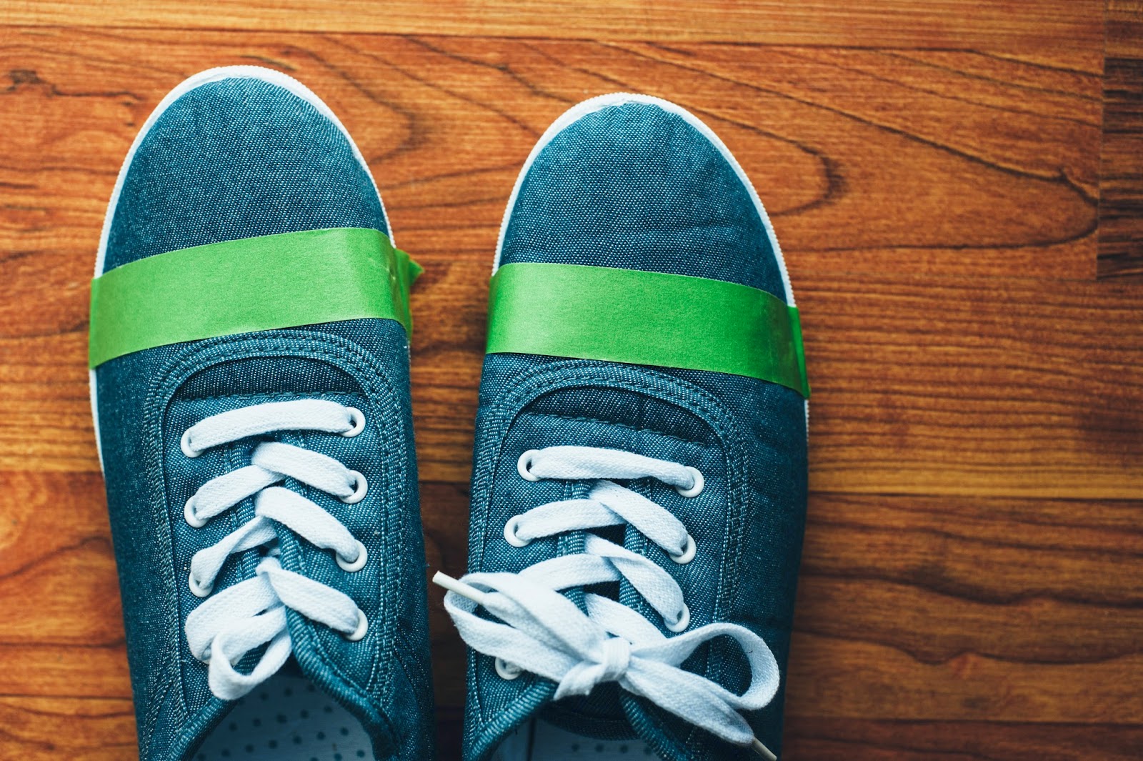
 Below, you'll see the shoes beforehand. The fact that they're denim gives them a bit of extra charm, but they're kind of blah in my opinion.


 I decided to give them metallic gold tips. I used this frog painter's tape to give me a crisp line. 

Here they are after one coat...

And after two coats, all done! This project literally took me ten minutes. I couldn't love these shoes more! 


My creative spark was ignited, so about a week later, I was inspired to turn these plain white shoes into awesome summery cuties. I was inspired by a pair of Kate Spade for Keds shoes, and I painted some lemons on them! These took more like an hour to complete, as the painting was a bit more detailed.

 I took the out and started by painting in the basic shapes and shadows/shadings of the lemons. You can see that I had some spill over onto the lip on the side - that is really easy to clean up with a knife or razorblade when you're done!

Then I added black outlines to define the fruits and painted certain sections bright yellow to define them more.

They are so cute and add instant cheer to any summer outfit! :)


If this post inspires you to make any shoes of your own, I'd love it if you shared!

Happy Thursday, brave & wonderful friends!

Tuesday, July 22, 2014

SHOOT | Monnie, Scott, Rachel, Chris, and Meg

I get a session every once in awhile that is life-changing, and that's how I feel about getting to photograph Monnie and her family. You see, Monnie is a cancer survivor with an amazing story. Hers is a miracle that I rejoiced in getting a part of telling. The day before our session, Monnie found out her cancer is in remission - this after she has been given the news that her cancer is terminal, multiple times. 

A friend of mine from Indiana has been battling cancer for some time, and she is quite young (not even 30 yet). She was recently given the sad news that her cancer is terminal, and that she might have less than six months to live. I've been caught in that tension of prayer for healing and prayer for peace. Hope and hopelessness. I can only imagine how she feels, the mother of two young children, and wife to a wonderful man. It isn't fair. 

But to see here God's provision was a like a light of hope in the darkness. To see her wonderful family getting to laugh with her, to smile with her, to embrace her, was a blessing. It is important for me to remember that God's provision does not always include healing in this life. But how wonderful to rejoice in the miracle of healing!

Monnie, I was particularly touched by your strength and beauty. It radiates from you - what a privilege to capture it!

Monnie, Scott, Rachel, Chris, and Meg - thank you all from the bottom of my hearts for giving me the opportunity to document you at this joyful time in your lives!


Happy Tuesday, brave friends!

Thursday, July 3, 2014

M A K E | Home-sewn aprons

Those of you who know me know that I love to make things. I have lots of projects going at any given time, and I thought that by sharing them more often in this space it might push me to be more creative and more joyful in this small thing I love doing: making.

This was a springtime project I tackled a few weeks ago. I bought some pretty fabrics to make napkins to use in food photoshoots, and I bought extra of this particularly beautiful cotton with yellow roses and purplish-gray leaves and another rust-colored greenery. I immediately made a simple apron out of it. This isn't exactly a how-to, but I'll tell you how I did it. 

I have several wonderful aprons my mother made me about six years ago, and rather than use an apron pattern from the store, I just laid this down for my pattern, cutting and apron front and back (on the fold) with about 5/8 extra for a seam allowance, as my aprons are double-sided & reversible. Then I used the ties as guides to cut out ties, also leaving that 5/8 allowance. Then I sewed the ties together, leaving one end open, and turned them inside out. I did the same thing for the neck strap, leaving both ends open. Then I pinned the whole apron together with right sides facing in and with the straps pinned to the inside (where the right side of the fabric is). Then I sewed it all around, leaving about a six inch unsewn portion around the bottom so I could turn it right side out. Then I trimmed the corners, turned it right side out, used a corner turner to make the corners crisp, and ironed it. Last, I slip-stitched the opening closed. The whole project was fairly easy and only took me about 45 minutes. 

The rose apron cost me about $3 total in materials! You can't beat that.


I was on a roll, so I made this other apron out of scraps I'd had lying around for awhile. I found a bunch of old flour & seed sack towels on the attic awhile back and decided to make some aprons. This fabric sat around as scraps for two years, but now it is a lovely seed-sack, gingham, and cotton apron. I love it.

What are you making, lovely friends?

Wednesday, July 2, 2014

D I Y: Painted Backdrops for Studio Photography


I've loved shooting with backdrops since the start of my business, but I have yet to buy one. Most of my backdrops have been fabric. When I was just starting, I used the incredibly high-tech method of using pushpins to pin my fabric onto a bulletin board. Eventually I got my own studio and graduated to a more legitimate backdrop setup when I sewed my own casings to slide onto a premade backdrop stand. I store my backdrops rolled up on PVC to keep them wrinkle free, and it works wonderfully for me!

It wasn't until I discovered Oliphant Studio that I began to lust after a textured, painted backdrop. Oliphant's backrops are without equal, and for that reason they are expensive. If you are an established photographer, a backdrop like this is an awesome investment. I'm still in the early stages of my business, and I love making things, so I figured rather than buy a backdrop for around $1000-$2000 or rent one for $400-500, it was worth it to try and make my own. 

Enter the DIY! I bought a 3.5 yard stretch of canvas material from the craft store with a coupon for $20. It was 45 wide, making it almost 4 ft by 10.5 ft. With my operatic background, I've known folks who have worked in theatrical paint shops (my husband included). I knew the best paint to use would be that made for theatrical/scenic purposes, but after some research, decided the price point wasn't practical for this experiment. So, I read about some alternatives and ended up going with flat latex paint, which I thinned slightly (NOT that much) with water. You don't want to go overboard with your mixing ratios, or you'll mess with the ability of the paint to adhere to the surface. My main focus in adding water was to make the paint more flexible (and therefore less likely to crack), which was advice from a scenic designer & painter of 20+ years.

Materials needed:
3.5 yards Canvas or Muslin (I used raw canvas, purchased in the fabric section, 45" wide)
1 gallon latex paint (in a mid-range color)
Rollers
Paint pans
Plastic dropcloth
Brushes
(See below! I had to buy more materials to get the look I wanted)


In keeping with my budget, I opted for an inexpensive latex paint, at just $12/gallon. I only used about half this gallon of paint for this project.


Before I started, I steamed the wrinkles out of the cloth as best I could. You could also iron it and even prewash the fabric. I chose not to prewash.


I used the roller to apply a fairly thick coat of paint. I only needed one coat for good coverage.


After that part of the project, the steepest learning curve came in. I originally bought two colors of latex paint thinking I'd be able to create texture with just two colors. I was wrong! First, it was incredibly hard to get that soft, airbrushed look I was going for with dry brushes and with a dry-brush technique, the lines from my wood-plank floor were showing up. I hated it. It had kind of a neat chalky effect, but it really wasn't what I was going for. I also realized I was in desperate need of a darker color to create depth and to mix mid-tones. So I had to paint over it and start over with texture.


I took a trip back to the craft store and decided I'd take a stab at mixing deeper colors and making my own acrylic spraypaint.  

Second list of materials:
Acrylic artist's paint in a variety of colors (pictured: raw umber, primary yellow, primary magenta (red), primary cyan (blue), raw sienna, and white)
Spray bottles (the smaller ones worked best)
Airbrush medium


I mixed up a cocktail of paint, a little bit of water, and a little bit of airbrush medium. I can't give exact ratios, because it was honestly different each time. I ended up with a different color each time I mixed, too, which gave my backdrop more depth. I mostly used raw umber, raw sienna, and white, with a little blue and yellow mixed in for coolness because I got a gray-green base.


In the early stages - way more depth! I feathered the "spray paint" & splatters with a dry brush as I went and as I desired.


I added several rounds of different dark and light colors to create an uneven, more stone-like texture.
It isn't perfect (it isn't mean to be) and I love it! It came out looking just as I wanted it to! I store it rolled up, as that is the best way to prevent cracking and keep it looking its best.

Below, see a few shots of the backdrop in action. These were shot outdoors on an incredibly windy day. The backdrop is easier to work with indoors, where I can stretch it more easily on my background frame, but in this shoot I liked some of the wrinkles and textures created.


Total cost of this project: $50-80, depending on the painting supplies you already have at home. I'll be painting many more of these!

If any of you are considering painting your own backdrops or have done so in the past, I would love to hear from you! If I can answer any questions I'd love to do that too. Have an excellent day, brave friends!